So after doing some research and finding out what a diagrammatic is. I want it to be legible yet designed well, I want it to be fun as well and different, Not your typical dashboard but it still functions well. But of course I’ll share any other ideas for the project but right now I’m going to focus on a mind map and gather a lot of ideas and styles for which I will do some research for.
https://miro.com/app/board/uXjVLFbf1fg=/
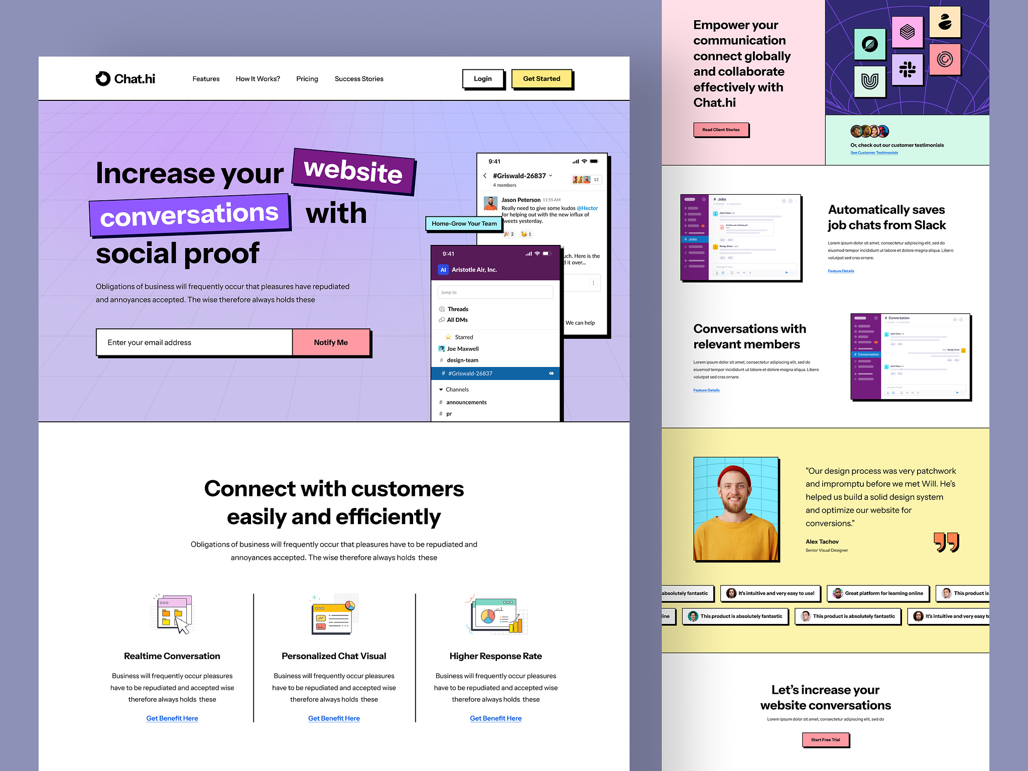
As I was searching for a design to follow I wanted to do something different and I stumbled across Neubrutalism and I just found that it stood out and was more designed and I just feel that the things that we have learned in the course with the icons, imagery and illustrations I feel Neubrutalism is a perfect way to showcase what I’ve learned, some early ideas with it are Mascots, Hand-Drawn Icons made by yours truly, and funky fonts.
But first it’s important to first ask:
Neubrutalism is an extension of the existing design movement: Brutalism. Similar to it’s predecessor, Neo or Neu Brutalism focuses more on simplistic forms and functionality that is seen as an opposite to the minimalist design styles like Swiss design
Below are some examples of Neubrutalism in UI
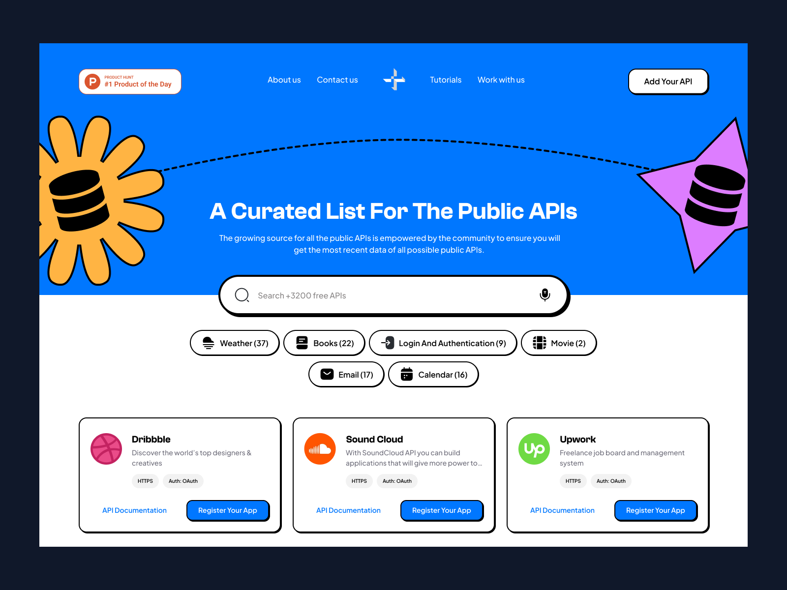
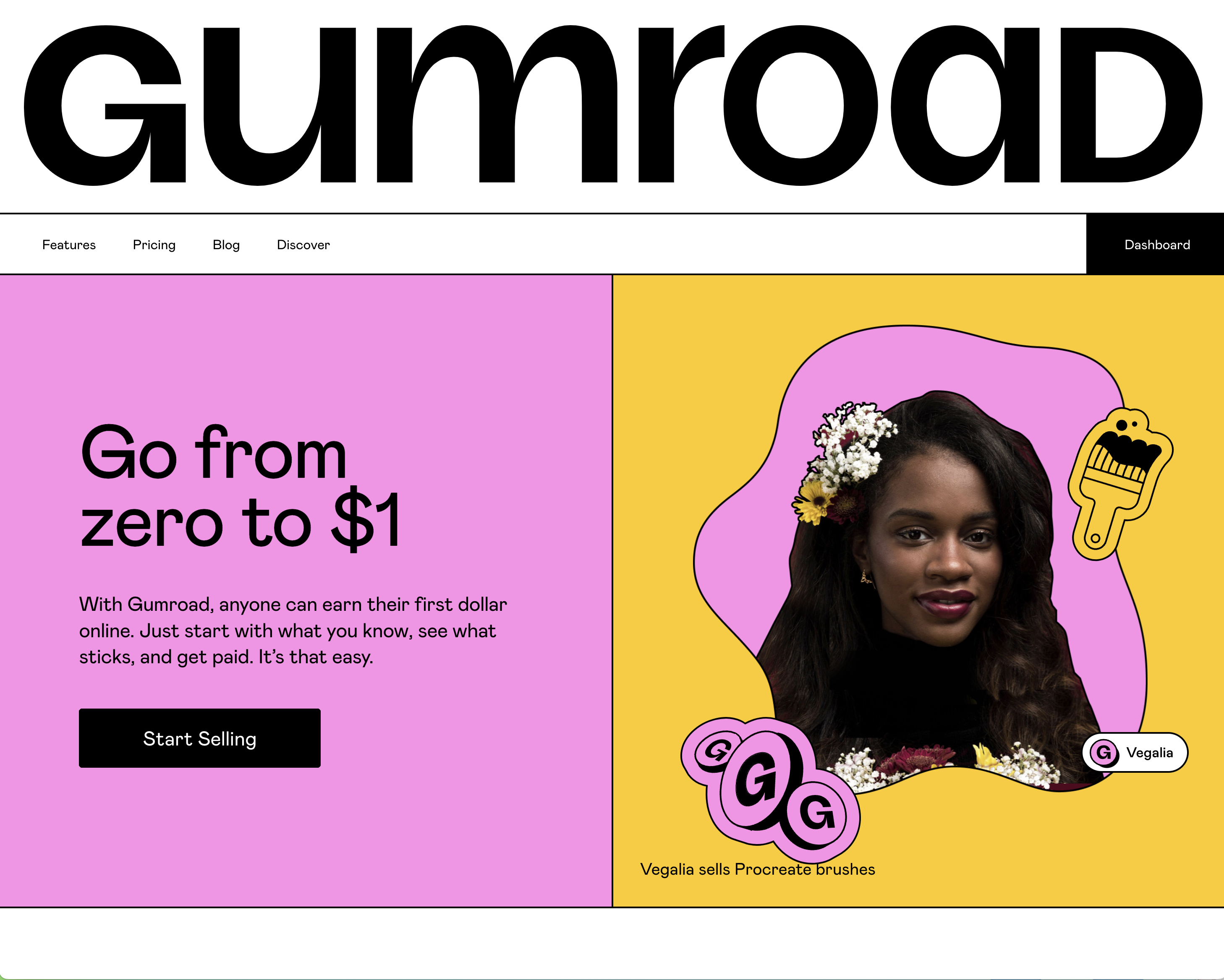
Some common features of the Neubrutalist design are:
I was talking to Marlow and Erin in class and was showing them the design style I was thinking about using and the statistics and I said “Of course I had to record the data on the worst week of the year for me” and Marlow suggested why don’t you use that as part of the dashboard? And I thought that would be a great idea, the bright colours and iconography with the negative subject matter to me is hilarious, So I think that might be the main idea behind a dashboard, As a lot of them focus on the positives whilst mine will focus on the negatives